I have been asked to do some book review readings on the wireless. I have been approached by a local radio producer/broadcaster and asked to write a selection of book reviews to be aired over four Sundays in September. The readings will be about five minutes long, but I will also be including a variety of locally pitched top ten charts, and possibly some information about exciting up and coming releases.
All in all a fun and exciting challenge to be approached for. I had a sit down meeting with the producer/broadcaster yesterday and finalised the books. The show will have a limited run through September, but will be broadcast on the Internet too, so keep your ears pricked and alert!
The home of my creative exploits.
Friday 19 August 2011
Thursday 18 August 2011
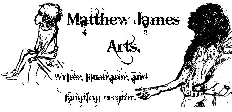
New blog header.
Just a quick message to say that I hope you like the new blog header. I decided to include a couple of my own illustrations from the Gormenghast project. The characters are the insurmountably talented Mr Peake's, but the reproductions are my own.
A Maelstrom of Images.
It has been a long time since my last entry, but the months have been packed with creative exploits. My illustrating, which until now has only been a fun distraction, has suddenly become a vital part of my paid employment. The last six months have seen me illustrate and build two campaign windows for Waterstone's. One centred around the centennial of Mervyn Peake, the second around the explicitly popular children's characters 'The Octonauts'.
It has been a very interesting process that has seen my artwork transition from a personal pleasure, to a professional work. My manager approached me with the proposition of building a clock face to put into a window to promote the works of Mervyn Peake. A window planned to coincide with his centennial. Being a fan of Peake's Gormenghast Trilogy I was thrilled at the prospect. Little did I realise what I would be setting in motion.
I had no idea how to plan or execute a project of this type, and resorted to falling back on my fleeting experience of technical drawing whilst studying engineering. I put together a variety of rough design sketches and started a process of drafting and sourcing potential visual components. After a week I felt I had the beginnings of an idea for the clock face, and how to execute it.
I then made the mistake of sitting down with my manager to finalise the idea, and swiftly discovered he wanted more than just a clock face... Two large posters, a backdrop, and signage more to be precise. After a day of fervent scribbling I had drafted some rough ideas for each of the additions, and threw myself head long into the drawing.
I started with the two posters. I decided to create a collection of Peaks own artwork from The Gormenghast Trilogy including the characters names. The hope was to give both posters the feel of a visual roll call of dramatis personae. Thankfully Peake's visual style has a lot of cross over with my own drawing style, and was easy if time consuming to reproduce.
I then moved onto the clock face. This was a more complicated challenge because of its size. Drawn on one long roll of A0 cartridge paper, I outlined the face in several blocks, then filled them all in once the outlines were finished. From a purely logistical standpoint, my antique writing desk was only just big enough to fit the paper onto. Once the face was illustrated I drew the hands separately, cutting them out and mounting them onto the finished face. This ensured a continuity in the image behind the hands.
After the illustrating was completed, I used recycled POS card to mount the face, and then mounted the card onto a recycled OUP press cardboard dumpbin. Once the drying the process was completed the clock face was finished.
That done it was time to work on the backdrop. The city of Gormenghast is described as a vast sprawling castle, with the dominating Tower of Flints rearing above it all. I used images of real European castles to create an eight foot long back drop, which I then cut out of black sugar paper to give me the silhouette.
One quick portrait of Mervyn Peake, and the parts of the window were finished and ready to be installed. The final installation looked like this:

The final installation was received well by the store, Waterstone's headoffice, and the publisher; with one member of the public asking if it was possible to buy the posters I had created. In retrospect I should have said yes. Every penny helps!
Off of the back of the success of the window I was asked to create an Octonauts display in the same vein. Feeling high off of the success of my Gormenghast work I readily agreed.
I started the window with one large overriding concern. I don't work in colour. Anyone who has the dubious honour of remembering the scratchings I did at art college can attest to the historically unsuccessful nature of those works!
That said I could happily outline all of the work before I had to consider colour, which is what I set about doing. The work consisted of a large seascape background, modelled on a scene from one of the Octonaut books, and a collection of character standees. I chose to draw Captain Barnacles, Kwazii Kitten, and Dr Shellington, as well as the large submarine the GUP-A, used by the underwater adventurers.
Once the outlining was completed, I couldn't procrastinate over the colour issue any longer, and went to have a chat with my friendly art shop assistant. He quickly pointed me in the direction of Derwent's Coloursoft pencils, that would give me the level of control I wanted, with a suitable vivid appearance.
A lot of colouring, several blisters (not nice on your hand!), and one broken pencil sharpener later I had coloured all of the characters and most of the seascape. To finish the larger areas of block colour on the seascape I used pastels for a quick fill.
I only had three weeks to get everything finalised and installed. Needless to say this resulted in a lot of all nighters, and one three day waking stretch, but was completed the day before the stores most important head office visit. The final installation looked like this:

Thankfully this installation was also well received, with photos even making there way to Fisher Price, the toy manufacturer.
All in all I am quietly satisfied with the final outcome of both installations. I have learnt how to apply my skill with a pencil to a larger more professional sphere. I am now giving more thought to how to combine my illustrating with my writing in greater depth. There is talk of more window work on the horizon, which I greet with a mixture of excitement and utter terror. But ultimately I'm not happy unless I have my head buried in some kind of creative endeavour, and Waterstone's are giving me the latitude to explore a new outlet for my madness.
Subscribe to:
Posts (Atom)